Steam Desktop UI needs to get its priorities right.
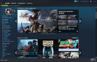
The landing page of Steam's desktop application sends you straight to Steam's store, which is a mess of buttons, options and images, which is quite the turn off. As I frequently use the application to access my games on Steam, it always irks me to have to go through this page. Users don't buy games on a daily basis, so it doesn't make sense that Steam's landing page should be it's store. It almost seems as though it was a design decision aimed purely at earning more money instead of improving the user's experience. In addition, the page itself seems to be extremely choppy, likely due to the large number of images / videos it needs to process. In fact, it does remind me a little of yahoo's landing page, albeit worse - a classic example of having too many things going on on a single screen. Which reminds me of a talk I attended before on UI/UX a while back, the speaker (Su Yuen) mentioned that for each screen on the application, choose only 3 m...